

Jesse Simon: ‘Is it possible to be nostalgic for a time you didn’t live in? I think it is.’
The Anglo-American typography expert on the magic of neon, signage in both Germanys, and the umlaut as engineering problem.

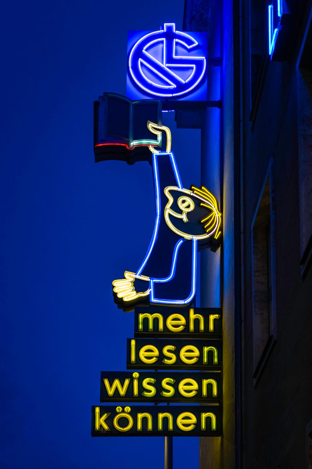
There they all are, shining, shaped in block letters or cursive or some creative combination of both. Apotheke, Blumenladen, Hotel, Theater. Now a boy with a book, now various glasses, now some penguins. A mug of beer with a face and two hands, offering all passersby a very cheery thumbs up. KRANZLER, KINO INTIMES, KARL-MARX-BUCHHANDLUNG. The golden age of neon signage might be long behind us, but all across Berlin—and the rest of Germany as well—there are charismatic little holdouts, colored tubes of gas that light up the street with business names or images or both. Some of these have been intentionally preserved, like the heritage-listed exemplars all down Karl-Marx-Allee—a rather surprising hotspot given neon’s early association with capitalist temptation and gaudy American vice. Other signs simply remain, patiently indulged or overlooked by modernisers. A few are decidedly worse for wear.
So what do they add up to? What message might yesterday’s signs have for our present? Jesse Simon likely knows better than anyone else. The British-American Wahlberliner, a writer and designer who teaches at a private university in Berlin, has spent years chasing down and photographing neon signs all across Germany. The result is Neon Deutschland—Simon’s third book after Berlin Typography and Plattenbau Berlin. Here a fascinating introductory essay opens into a series of chapters with explanatory text and photographs of neon signage across Germany’s regions one by one. (It is, for now, only available in German.) On a sizzling hot day, I visited Simon at his printmaking workshop, the Dessauer Press & Cocktail Lounge.
What we’re having: nice cool air from the fan (JS), nice cool air from the fan (AW).
Jesse, this book is delightful. How long has it been in the works?
Let me start from the beginning. Around 2016, I started photographing signs in Berlin. And that led to the Berlin Typography Project, which basically turned into the idea of me taking pictures of type and letter forms in cities. Whenever I visited a city for some other reason—usually to see bands or visit friends—I would bring a camera and take pictures of whatever signs were there. It was all very casual. The pandemic is when I started getting more serious about going to places to take pictures of neon signs specifically. With Berlin Typography, it was about the variety of letterforms within the urban space. If I did that for every city in Germany, it would be too much; it would be impossible. I had always been drawn to neon signs. So I decided the focus would be neon and the geographical scope would be German cities.
What is it about neon that attracts you?
Neon is, for me, a window into the past. It is a window into a past Germany that I never knew first-hand—because I was not living here and not even born for most of the 1970s—but that I felt was rapidly vanishing. And the level of artistry and craftsmanship that went into the signs was superb—the details. The fact that so many of them had this really familiar style of handwriting, but still no two of them were the same. They must have started as someone’s handwriting that they then took to a neon shop and said, ‘Make it look like this.’ So you see all these signs for flower shops, each written in a cursive hand, but it is not one mass-produced sign. Every one is slightly different. The signage reflects one particular tradition of both handwriting and formal typography, with the styles and fonts that could be used, but there was also an endless diversity within that.
The other reason is that I just think the neon sign has a wonderful power that all of the technological advances of the last decades still haven’t improved upon. In the book’s introduction, I talk about the original isolation of neon as an element. The first time they put electricity through neon, they were just transfixed by this red-orange glow. And I think neon still has the power to transfix. Whenever I see a neon sign in a city at night, there is something very warming about the glow. I don’t know if it’s some primal thing of seeing light in the night-time, or just an idea of what urban space should look like. But there really is something fascinating and powerful about it.
Neon was once considered very modern; even the name means new. Is there a retro-future aspect going on? The neon signage in Manhattan, for instance, seems to represent a certain nostalgia for the energy and opportunism of the interwar years.
Well, the history of neon in the United States is very different from the history of neon in Europe. I remember the first time I went to New York City in the nineties—I mean, it’s a different place now, sadly—but a lot of those old signs were still there. What were the neon signs for? Places you could buy booze, drug stores. Neon was used in a very particular way, and it peaked quite early in the States. The 1930s was the golden age of neon, and then after the war it starts to be associated with Skid Row, with dodgy neighbourhoods, soup kitchens, signs that say Jesus Saves. The best example I had for that was when I was driving through the States in the 1990s and there was an animated neon sign that was supposed to flash back and forth between HOTEL and MOTEL, but the pipes for TEL were broken, so it just said HO MO HO MO HO MO. And man, I wish we had phones with cameras back then, because that would have definitely gone viral (laughs).
There is a story about the Chelsea Hotel’s sign breaking down and flashing HEL HOL.
Yes, that sort of thing. Flop houses, roadside motels, cheap diners… In Europe in general, and in Germany in particular, much of the interwar neon signage was destroyed during the war. When neon was coming to be associated with dodgy parts of town in the States, it was experiencing a second golden age in postwar Europe. In Germany, it became part of the postwar economic revival. It belonged to the idea of rebuilding the city and bringing it back to life. That process of reanimation was inseparable from the neon sign. So what you get is that basically everything has neon: cinemas, restaurants, local flower shops, apothecaries, all of them have neon. And there was a kind of golden age where everything was neon. When people in the States are nostalgic for neon, they’re nostalgic for a different period.
Is it possible to have nostalgia for a time you didn’t live in? I think it is. I see students these days walking around wishing they lived in a time when the Walkman was still a thing. And I’m like, yeah, I lived through that, so I love the fact I have 30 gigabytes of music on my phone (laughs). But I think there is always this nostalgia for a time that you don’t remember or only barely remember. And even people who did experience it—I’ve shown this project to a lot of people, and some of them grew up in Germany and think it’s so familiar that they don’t realize this is a part of their life that’s actually vanishing.
Are you more attentive because you are an outsider to Germany? Or is it just that you are a design and typography specialist?
It’s absolutely a bit of both. For better or worse, I mean, I do tend to fixate on type in the world. When I’m waiting for a train at the U-Bahn station, I’m analysing—not just the platform signage but even the posters, looking at how type is used. But there is also a kind of blindness if you are used to walking through these cities. I think a lot of people just block the neon out. They aren’t looking for them.
In the introduction, you describe the ongoing disappearance of neon signage from much of German cityscapes from the 1970s onwards. Why have people been getting rid of it?
I would need to answer that question separately for former East Germany and former West Germany. In the former East, there is something I noticed not just with neon signage but with all kinds of signage. When I first ventured out to Weissensee and Pankow for Berlin Typography, I was really excited. I thought it would be a goldmine for neon signage. But when I went, there was almost nothing. I thought, well, this is strange. I started doing research and came up with what I call the Regime Change Theory of Signage, which is basically that, in the West, there was no real regime change, West Germany just became Germany, whereas the DDR ceased to exist and the former East got subsumed into this other country known as Germany. And this means that, regardless of what one might say about quality of life in the former East, at the time there was a rush to move away from the past as quickly as possible, which meant getting rid of basically all the signs that looked like they belonged to the past. There was a five- or ten-year period in the 1990s where East German signage disappeared very quickly. Some were saved—like how Karl-Marx-Allee is now under Denkmalschutz, and that extends to the signage—but so much was already lost. A lot of the signage also disappeared because the companies disappeared, all the People’s Owned Kombinat of Fine Double Concentrated Soups or what have you, they ceased to exist as soon as the people stopped owning it. And they got merged with Western companies and changed their names and identities. In Leipzig, as I show in the book, they were a little bit slower to get rid of the signs and a little faster to realise the historical value of some of them. I mean, this little guy is cool (points to a sign in the book).
In terms of the West, I think it was a much more gradual process. And I think it often came down to how much money there is in a place. If there is a lot of money, there is a lot of property changing hands. There are new shops opening. In Berlin, a shop could close and stay vacant for who-knows-how-long until they find someone else, so nobody is going to get rid of the neon sign unless someone takes over the shop and decides to remove it. In Bavaria in general, I found very few neon signs. I don’t want to get into stereotypes, but Bavarian cities are very clean compared to, say, the Ruhrgebiet. They’re immaculately kept. And I think that might extend to the shopfronts as well. There’s just not so much tolerance for an empty shop with a broken neon sign in front of it—and not so much space for holdovers from the past. Especially those covered in birdshit.
In terms of design and typography, what were the features you found most interesting? There seems to be a lot of handwriting and a lot of big block capitals.
Properly, the word typography should only be used when you’re using an actual typeface. But I think if we extend it to type and letter forms, then yes, there are certain trends you can identify across the neon signage. Handwriting is a huge one. And handwriting is one of those things that is immensely personal, but also, it came from somewhere—your education, your schooling. I think German handwriting is quite different, too, from handwriting you would learn in another place. If you asked a person to write something by hand, it would be different depending on if they were educated here or in the States; I would even venture to say it would be different if they grew up in the former East or the former West. You can notice differences, not just in the individual hand, but even in the way they construct the letters. You’re bringing personalisation to a very rigid form. So cursive is definitely one recurring feature. There is also some blackletter. And the use of very geometric sans serif capitals.
And the umlaut!
Yes, of course, there’s the umlaut—and the Eszett, the long ß. These are the kinds of things that really distinguish neon signage in German.
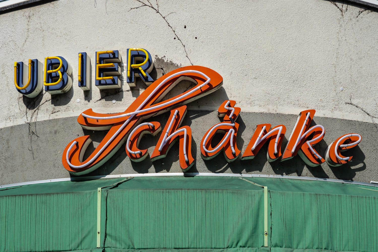
It’s a terrific challenge for the designers, like, how do you make an umlaut using continuous piping? Sometimes it just looks like a squiggle. Like here (points at book).
Yes, ah, that’s a fantastic one there. That is what I like to call the lightning-stroke umlaut, and it’s basically an attempt to write a cursive umlaut, like when you’re writing cursive and don’t lift your pen the whole way, so it becomes this lighting-bolt shape. And here (pointing) we’ve got two lovely ones. When you write an umlaut, you can do whatever you want. You can do two little circles or you can do two lines or one of these other styles. But when you turn that into neon, it requires quite a bit of engineering. You can see how people have made little bits attached to the letter or sticking up from the letter—because they’ve all got to have electricity running through them, so you need an actual physical connection between the word and the floating umlaut.
Constraint drives creativity, I guess. The same seems to apply for the figurative signs: the penguins, the stars, the sunglasses. They all look so brilliantly camp.
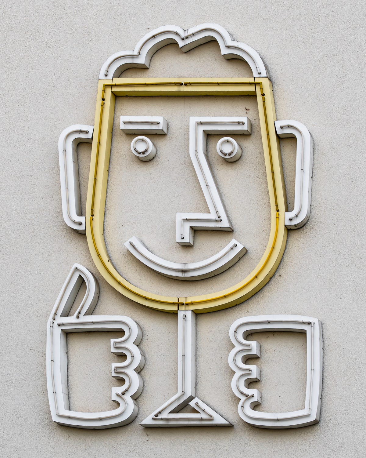
Sadly, most of those don’t exist anymore. There used to be a lot of them, and especially in the former East, where they were a lot more creative. But I mean, you do still have that beer guy in Leipzig. There he is (points). And I mean… what an absolutely brilliant sign. It’s an anthropomorphic beer for you to drink. And it’s giving you the thumbs up, like, ‘Time for beer!’ You don’t often see that level of creativity in the signs that have survived, which is a pity. But if you had that on the side of your building, would you get rid of that? Of course you wouldn’t!
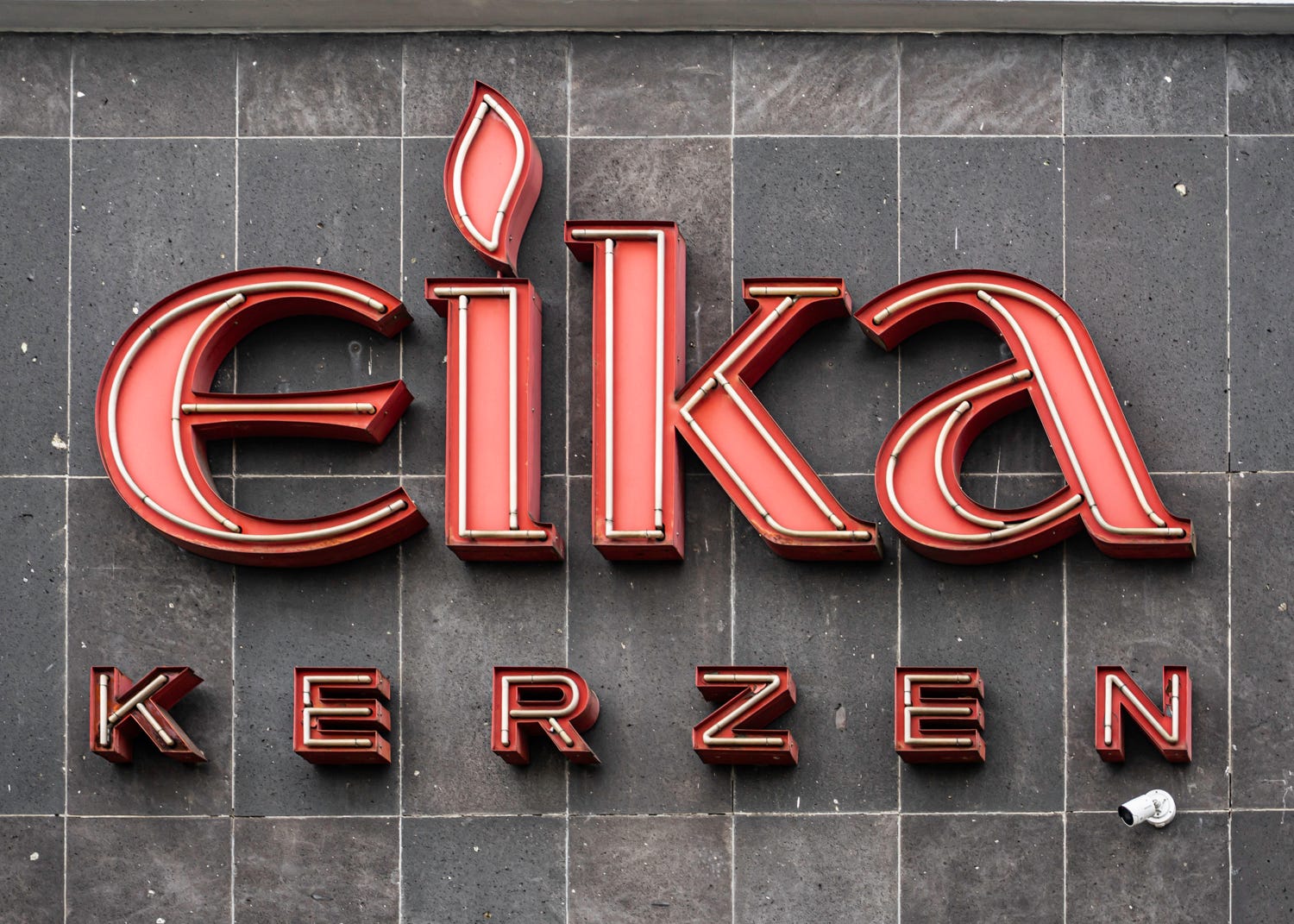
There’s a sign for candles I really like, where the lower-case i becomes a candle with a flame. I forget where it is…
In Fulda! Yes, the candle is in Fulda! That sign—you know, I often go to Frankfurt for various reasons, and Frankfurt would often be my gateway to the West because it’s an easy train ride from Berlin, and from there you connect to the whole western railway network. And I must have taken the train past that candle sign, I don’t know, ten times. And I was like, I have got to stop in Fulda one of these days to get a picture of the sign. But the sign… you can see it from the train station, but it’s a good fifteen minutes’ walk through absolute nothingness to get to it. You walk between the train line and an empty industrial area. And it was like, why am I doing this to myself? But then I got there and I thought, oh, that’s why.
When you photograph the signs, what is it you are trying to capture? I got the feeling you wanted to register their context as well—the architecture, the streetscape, sometimes even the crappy condition some of them are in, which would have been easy enough to leave out.
I love the texture. I love the age and the wear of these things, because that’s part of them. Some are encrusted with pigeon shit. Some have forty years’ worth of spiderwebs and dust on them. They’re not clean—they’re not always conventionally beautiful—but they have that feeling of belonging that I love. In general, what I was mostly trying to achieve was to have a usable photograph for every one. I took ten or fifteen of each one, trying to get different angles: sometimes standing across the street, sometimes standing up close, sometimes from an angle, sometimes dead on. You don’t always know in the heat of the moment what is going to look the best. But later on, when I was choosing the pictures, the best one—the best angle—was almost always immediately apparent. With a lot of them, I was trying to give a sense of where it was, if it was a modernist storefront, if it was glowing wonderfully in the night, what sort of building it was attached to. Any time that the architecture really matched the neon, or really clashed with the neon, I really tried to bring that out in the photographs.
In the introduction, you say that—while it’s good that neon appreciators are making museums for old signs—it’s still a pity for them to be preserved outside their context. Are you trying to preserve them in a different way with this project?
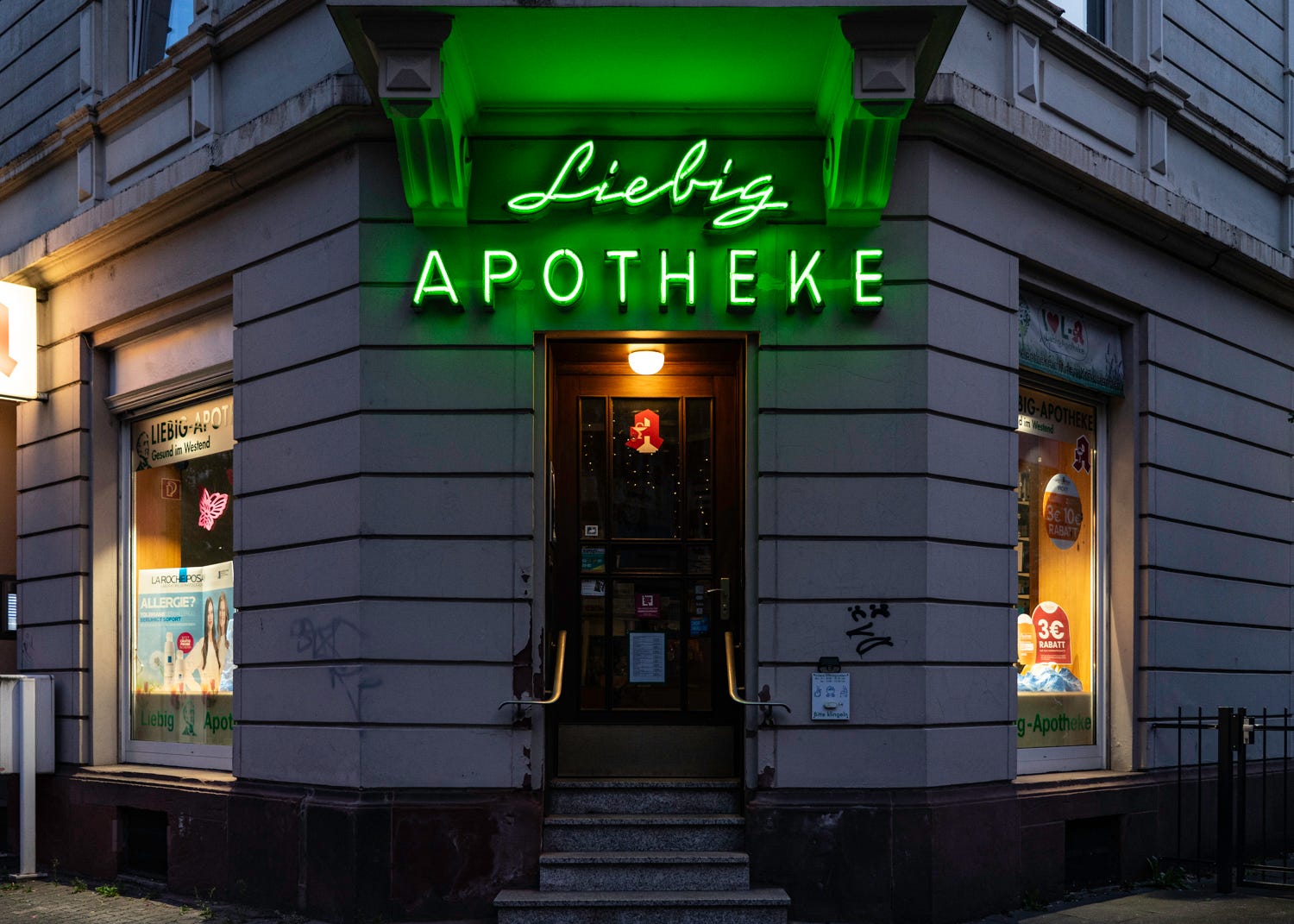
Walking through a city at night and seeing a neon sign is completely different from going to a museum and seeing that same same sign there. The context adds so much. For example, this one sign in Frankfurt, which I almost made the back cover, it was this Altbau on the corner, with a sort of 45-degree cut on the building. And the door was there. And just this sign. When I took the picture, the sun had just set, there was no more light, and the street was really leafy and green, and everything just had this beautiful twilight feeling. And the sign was there, burning out into the dark blue light of the city. The sign on its own was great, but the context of the sign was magical. This summed up everything I loved about urban neon. If you take the sign away, you don’t get the city. And the city is what gives magic to the sign.
What are you working on now?
I’ve started work on a project about Berlin’s doors. And I have a longstanding project about patterns in Berlin—weird, cool textures. I don’t know if either of those will become a book. I tend to go back and forth between architecture and typography as two things I’m really interested in. I know there’s a great book to be written on postwar public urbanism projects. I’m not sure if it would be too niche, though. And you always need to convince a publisher that the world needs a book on this or that. So I do have a lot of ideas. I’m never at rest. I’m always working on something.
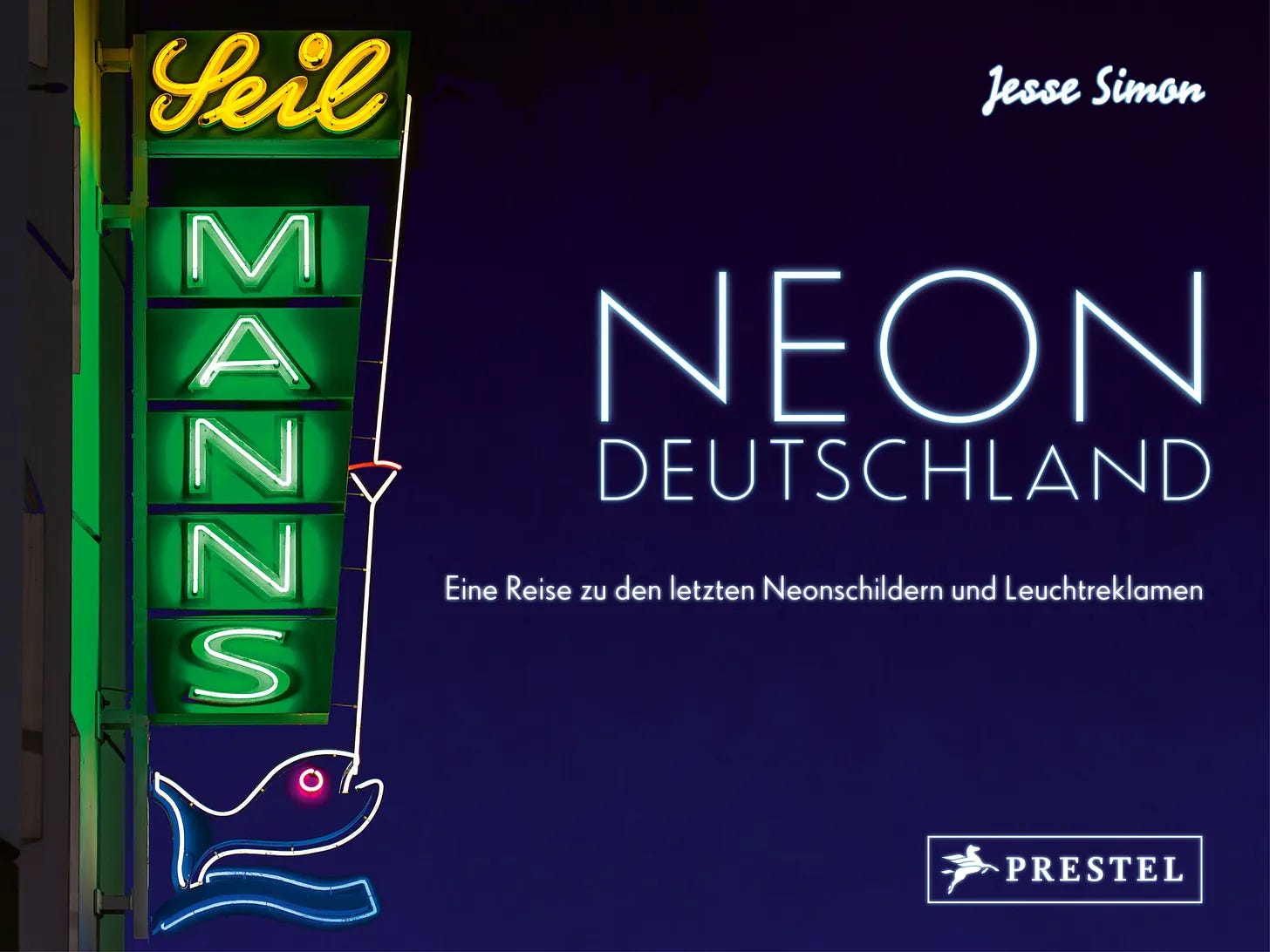
Jesse’s book Neon Deutschland is published by Prestel and is available in all good German bookstores.
Thoroughly enjoyed this!